Sora
A modern pasta bar identity combining artisanal authenticity with design
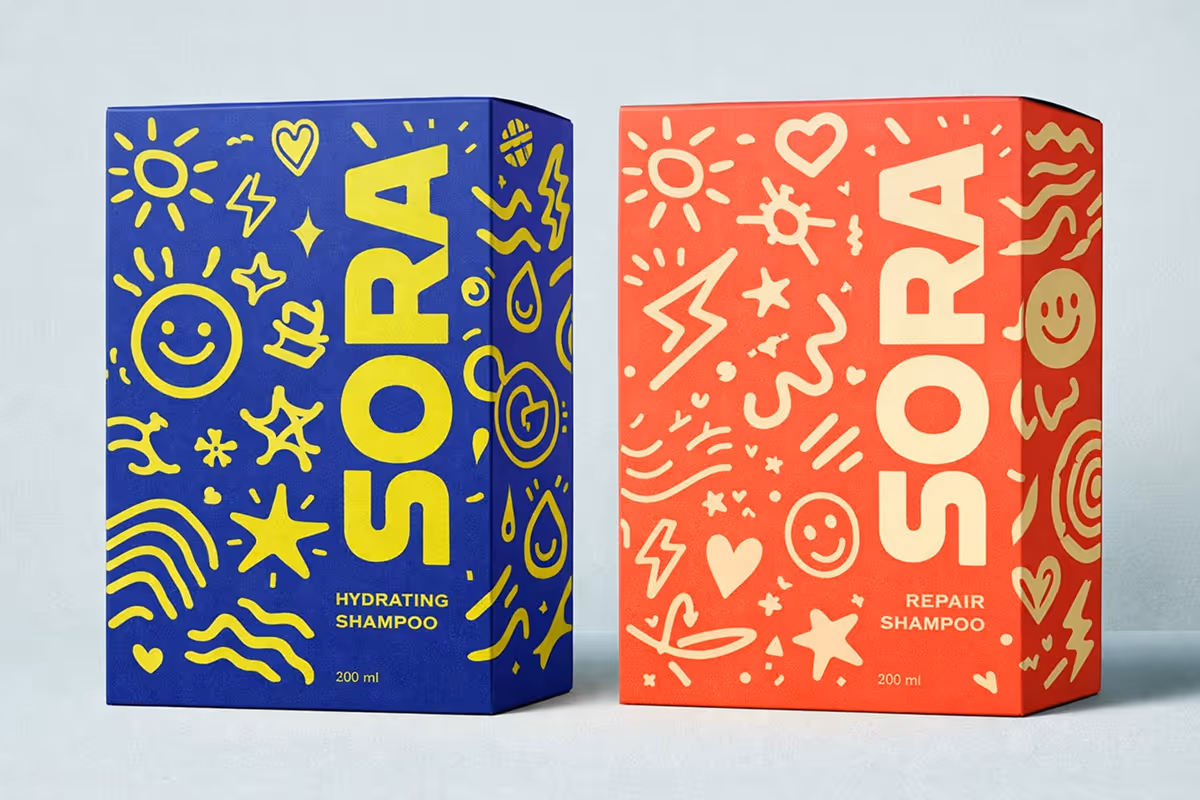
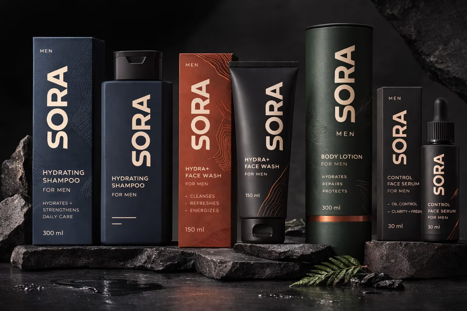
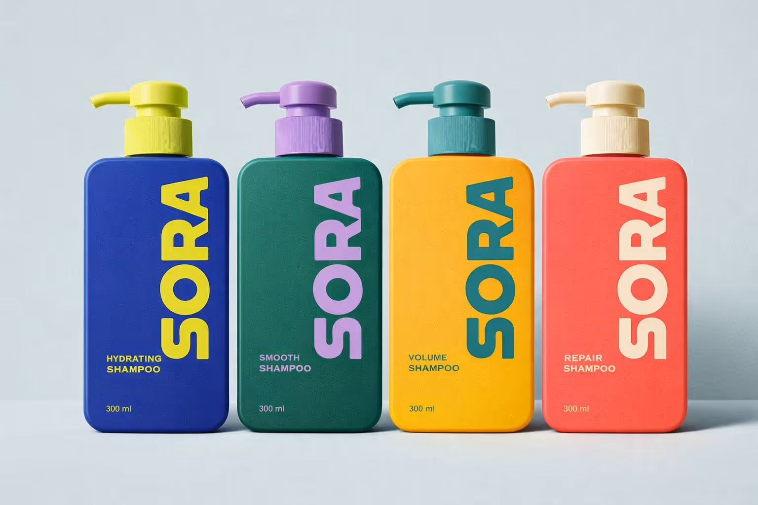
We worked closely with the Sora team to develop a vibrant, expressive brand for their shampoo range one that brings personality to the bathroom shelf and resonates with customers who want their haircare to feel as good as it performs.
Brand identity
Positioning
Packaging Design
Web Design
Project Overview
Client
Sora
Studio
The Drawing Board
Timeline
6 Weeks
Disciplines
Brand identity
Positioning
Packaging Design
Web Design
Strategy
Research & Strategy
Through extensive research, we uncovered that Asian cuisine is one of the most sought-after options for dining. However, diners expressed a desire for Asian food that felt fun and modern, avoiding the familiar yet overly spicy desi-Chinese style. This led us to position Koi Koi as a vibrant, colorful brand, offering a diverse mix of pan-Asian dishes that engage guests with both the food and the experience.
Naming Inspiration
The name "Koi Koi" was drawn from a Japanese card game, where the phrase koi koi means "come on," used when a player chooses to continue playing. This name perfectly encapsulates the brandʼs playful, engaging spirit, encouraging guests to embrace the fun of discovery and return for more.
.avif)
Visual Identity Design
Inspired by the colorful heritage of Asia, Koi Koiʼs visual identity took a funky, offbeat approach. Refraining from the typical design cues such as red, lanterns, or traditional scripts, we chose a vibrant mix of colors to reflect the playful and diverse nature of the brand. The visual identity evokes a sense of adventure, mirroring the eclectic blend of Asian influences in the menu.
.avif)